Topics in Book Design
- What’s your favorite font?
- The architect of the page
- Dressing the part
- The color of the page
- Controlling page depth
- A picture is worth a thousand words
- The lowly paragraph indent
- Dash it all
- The ties that bind
- It figures
What’s your favorite font?
Many discussions of book interior design begin with some version of the question, What’s your favorite font? I’ve heard and read discussions among publishers that start there and descend. This approach to book design is backwards. Font choice is important, but it comes later in the process.
A book design begins with an analysis of the manuscript itself. What category is the book in? Who is the intended audience? What are all the different kinds of elements making up the book (lists, sidebars, tables, charts, images, heading levels, and so forth)? What will the book sell for? How long is the book? How will the book be printed? How many copies will be printed initially?
Working from that information, the book designer can develop an integrated conceptual plan encompassing paper type, page size, margins, and page count. Once the publisher approves that plan, the designer can begin investigating font choices that are appropriate to the content.
The architect of the page
The book designer is the architect of the page. The remit is to design the page to serve its function—readability, connotation, cost, and aesthetics.
- Readability. The designer’s first obligation is to the reader. Readability is both biologically bound and culturally bound. That is, there are physiological and psychological components to reading that we share across cultures; and there are cultural norms that affect our expectations. The typographer tries to stay within those cultural norms so the reader is not distracted by something that looks odd, even if that something would be completely unremarkable in another country. A simple example: British spelling and punctuation look odd to US readers and vice versa. The physiological and psychological aspects of typography have to do with line length, line spacing, point size, and some of the more arcane details of composition.
- Connotation. As readers since early childhood, we have grown up immersed in conventions we do not think about. We are not supposed to think about them in the left-brained, verbal, analytical sense. However, we have absorbed them, in a right-brained, intuitive, experiential sense. Let me try something obvious here:


Which of those three fonts would you be most likely to see used for headings in a physics textbook?
Connotation extends to the look and feel of the page, as well. How ample are the margins? How traditional is the layout vs. how modern-looking? When you look at the page, are you transported to a cathedral or to a schoolbus or to a tent in the woods? Book design encompasses more than just typography. The designer has to consider the nature of the paper surface and the way the book will be printed, as well; and both of these factors affect choices the typographer makes. - Cost. A book is a product. That is, you are going to pay for it to be manufactured and then you are going to sell it to a reader, and you hope to make a buck in the process. Therefore, you have to consider the cost of manufacturing as it relates to the price you want to sell the book for. The book designer has to take cost into consideration when designing the book, just as any other product designer—or architect—has to consider cost. In terms of book design, cost shows up in the form of page size and page count, factors that interact with readability and connotation at the boundaries of margin size, font choice, font size, and line spacing.
- Aesthetics. The designer’s job is to create an appealing, inviting page that helps the reader stay focused on the content that the author is trying to convey. At the same time, if the page is so luxurious that it distracts the reader from the content, then the typography is not serving its primary purpose.
Consideration of those four functions drives the form of the page. It does not define the form. Two skilled typographers, looking at the same manuscript and considering the same functional requirements, can nonetheless come up with quite different and equally successful designs.
Dressing the part
The design of a book page should be transparent to the reader. You do not want the reader to notice what a lovely and interesting typeface you’ve chosen or what a cleverly designed border you’ve added. No, you want the reader to understand what the author is trying to communicate, and that message is embodied in the words, not in their graphic representation. Nonetheless, there are times when it makes sense to let those creative juices flow.
Chapter pages are a good place to add display elements to a book. Some fiction for adults consists of many short chapters without chapter titles, and a modest chapter number is sufficient. Often such chapters run into one another without so much as a page break. And that’s fine if that’s what the book calls for. But in many other books, the chapter divisions are more important. Young readers in particular like to get a little visual reward for completing one chapter and starting on the next.
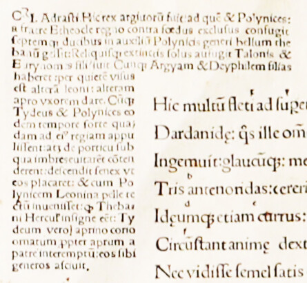
Browse in a library or bookstore to see some of the many ways designers have handled chapter pages and, where they’re present, part pages. There may be an outside number; the start of the text may be sunk far down the page; the chapter title might be in a decorative (but still legible) typeface; there may be decorative rules. And of course there are many other possibilities. One thing you will see frequently—and a good way to dress up even the plainest book—is a drop cap or other special treatment for the first letter of a chapter. A two-line drop cap, followed by three or four words in small caps, is a modest way to signify the beginning of a major new thought, which is what a chapter break or section break is, after all, or a good place to close the book and take a break. But in other sorts of books, that chapter initial can be something quite ornate. There are hundreds of beautiful sets of decorated initials, and they can really dress up a book where they’re appropriate.
I’ll work with you to find the approach that’s best for your book.
The color of the page
Well, black and white, right? No, not exactly. Color comes into play in book design in three ways; actual printing with inks of two or more colors (not what I’m talking about here); paper and text ink color; and what typographers call the color of the page, which has to do with font choice and spacing.
Paper color
For the vast majority of books, the printer will offer the choice of white or “natural” paper. In this context, “natural” is a buff-colored dye added during the paper manufacturing process; it does not describe some special environmental virtue of the paper. A great deal of fiction and some categories of nonfiction are printed on natural paper, which cuts down on glare for the reader. Science and engineering books are almost always printed on white paper, which seems to connote a reductionist, black vs. white viewpoint appropriate to the field.
Papers are white by degrees, though. Brightness can start in the 80s and range well into the 90s, as a trip down the paper aisle of an office supply store will quickly demonstrate. Printers will tell you the brightness of the various white papers they offer. Again, brighter is not always better, from the standpoint of reading comfort. Similarly, papers are available in various finishes. Enameled (coated) papers make a very heavy book (because to have paper thick enough—strong enough and opaque enough—for printing on two sides, coated papers have to be heavier than uncoated papers; the mineral coating is much heavier than wood pulp). In general, coated papers are less bright than uncoated papers. However, a high-gloss coating adds glare. Various gloss levels are available, down to a matte finish, which is excellent for low glare but eye-popping color reproduction. Uncoated papers may be smooth and thin (calendered) or soft and thick (“high-bulk”).
Ink color
A word on “black” ink. As with “white” paper, there’s black and then there’s black. If there are any printers left who will vary the hue of their black ink, from blue-black to brown-black, depending on the cast of the paper, I’m not aware of them. Typically, they’re all shooting for a neutral black. But both offset and digital presses vary in the density of the black applied to the paper. In the case of offset printing, inks vary in quality. When I evaluate printed samples from printers I am considering using, I take a close look at the printed page in good light. If the black is not uniformly dense and black, I choose a different printer.
Typographer’s “color”
When typographers looks at a page, they see a text block that has an overall color. Is the color light or dark? Is it too light (poor quality font, loose letter spacing, too much leading, poor printing)? Is it too dark (too heavy a font weight, insufficient leading, tight letter spacing)? Is it a comfortable read? Color is a design choice: you may want a lighter color for lyric poetry and a darker color for a mechanical engineering text. Choosing the right typesetting parameters to get the color you want can make a much greater difference to the appearance and readability of a page than typeface selection alone.
Ladders, rivers, and pigeonholes
Another principal aspect of typographic color is the uniformity of tone within a text block. Word processing programs generally do a poor job of controlling this. Modern page layout software generally does a good job. When you look at a page of type, you do not want to see:
- Ladders. Traditionally, a ladder was a series of four or more lines ending with a hyphen. With the advent of modern software, that limit has come down. On a single-column book page, the limit for consecutive hyphens may be two or even one, depending on some other parameters.
- Rivers. A river is a gash of white running down a paragraph where word spaces align with each other vertically or diagonally from line to line. Word spaces should, to the extent possible, be offset from each other on succeeding lines so they do not connect in a pattern of any sort.
- Pigeonholes. Pigeonholes are word spaces that are so wide they gape. If a paragraph looks more like a jack-o’-lantern than like a smooth, gray rectangle, there are pigeonholes to fix.
Hanging punctuation (optical margins)
When you scan down the right edge of a block of justified type, the short glyphs (period, comma, hyphen, quotation mark, apostrophe) form little visual nibbles in the margin. By allowing those characters to extend partly or fully into the margin, we can create the optical illusion of a block of type with a straight edge. This technique, called hanging punctuation, was not generally available, except at extra expense, during the age of metal type (it actually arose quite by accident, through a misunderstanding of a technique Gutenberg used in the Mainz 42-line Bible). Today it is available at the click of a checkbox. It’s not appropriate everywhere, but it’s a good thing to know about.
Controlling page depth
In traditional book design, facing pages should be balanced. That is, they should be the same depth. This rule does not apply at the end of a chapter, but it applies almost everywhere else. So when you are laying out a book (or evaluating a layout job someone did for you), you should always view it as a series of two-page spreads, with the odd-numbered page on the right (“recto”) and the even-numbered page on the left (“verso”), and you should check that the text block starts at the same place at the top of every page (with the exception of chapter pages) and that facing pages end at the same distance from the bottom of the page.
Nominally, you want all pages the same depth throughout the book. That is, you want to maintain a consistent bottom margin. However, there are considerations that can make this trick hard to pull off. So the commercial standard is this: Facing pages must balance; however they can run one long or they can run one or two lines short of the nominal margin. However, two successive spreads cannot vary in depth by more than one line.
What does this mean? Well, suppose pages 8 and 9 are one line short. Then pages 10 and 11 can be two lines short or they can be one line short or they can be the normal depth, but they cannot be one line long.
Widows and orphans
Why would you want to make a spread short or long? The usual reason is to avoid widows and orphans. Traditionally, a widow is the last line of a paragraph stranded at the top of a page and an orphan is the first line of a paragraph stranded at the bottom of a page. I say “traditionally,” because those definitions are reversed by some word processing software vendors, leading to much confusion in discussions between word processors and typographers. It’s therefore safest to avoid these words altogether and just talk about ensuring that the first two line of a paragraph stay together and the last two lines of a paragraph stay together. Doing this, in straight text, can result in pages running long or short.
It’s best to avoid both widows and orphans, but sometimes something has to give. In that case, an orphan (first line of a paragraph at the bottom of a page) is better than a widow (last line at the top of a page). The reason for the preference is that a widow is typically less than a full line of text. Sometimes it’s just a word or two.
One way to avoid both widows and orphans, when it seems that you can’t, is to find a paragraph with a short last line and tighten it up a little so that it ends up one line shorter. Other times, it’s easier to find a paragraph with nearly a full last line and rebreak it so that it ends up a line longer. Careful compositors use these techniques all the time to ensure their spreads balance and they don’t end up with widows and orphans.
Adjusting head spacing
Some page designs don’t allow for pages to run long or short. For example, if margins are narrow or the page has both running heads and running feet, there is really no way to cheat on the fixed boundaries of the text block. So this kind of page design is not a good choice if the book consists of long stretches of continuous body text, as you would expect in, say, a novel.
But in many kinds of nonfiction, it’s typical for the text to be broken up by various levels of headings, lists, extracts, and other styles. Nearly all of these text elements have some defined space above them, below them, or both. These spaces are available for adjustment to help the compositor balance the pages and force them to the standard depth. I can add space (evenly) above the headings on a page, adjust the space above and below a list or the items in a list, and so forth. As long as there’s a visual break defined already, the reader will not be confused if it’s slightly larger on one page than on another.
Feathering
Feathering, sometimes called carding (because in metal type the technique was effected with strips of cardstock), consists of making a small change in the line spacing on a page to change the number of lines that fit within the margins. The main problem with this technique (there are others) is that it changes the color of the page (discussed previously) in a way that’s distracting to the reader. Feathering is common in printed newspapers, but it is not acceptable in fine typography. I don’t do it.
A picture is worth a thousand words
Some images are okay to use in books and others are not. There are three general criteria to consider:
- Does the content and composition of the image add value for the reader (even if the value is purely decorative)?
- Is the image legally available to use?
- Is the image of a technical quality that can be successfully printed?
Content and composition
Some photos are valuable as historical documents. Others help illustrate and explain. Others merely brighten the reader’s mood. But a few well-selected images will have more impact than a bucketful of mediocre snapshots. Professional photographers may snap anywhere from a hundred to a thousand pictures for every one they publish.
Look critically at each image. Does it include distracting or confusing elements that will be hard to crop out or eliminate some other way? (In journalism, science, and scholarly work, manipulating a photo has ethical implications; but in many fields it is perfectly acceptable to do a little touch-up in Photoshop to add clarity for the reader.) Does the composition draw the reader’s attention to the most important element or away from it? Does it draw the reader’s eye off the page or into it?
Can you legally use the image?
“I found it on the Web” does not mean an image is free to use. Every image, whether it is a photograph or a drawing or a chart or a diagram, was created by someone, even if you don’t know who that someone is. Some images are in the public domain and you can use them freely. But most images are available for use only if you license them or obtain written permission to use them from their lawful owners.
Photos in your family collection are trickier. Perhaps the only photo you have of Uncle Ed is a proof of a studio portrait taken by a commercial photographer who died thirty years ago. Can you use it in your memoir? That’s not always clear, and copyright law is murky on such orphan works. Or maybe you have snapshots you took of your army buddies. If you took the pictures, you own them. But that doesn’t mean you can print photos of other people without their permission. If you don’t have model releases and one of your buddies who is still alive would prefer you not use his picture, you might have a problem.
These situations get complicated very quickly. Your best bet is to discuss the matter with an experienced permissions editor.
Is the image printable?
The number one confusion I find with clients who submit photos they want included in their books has to do with image resolution. A picture that looks fine on a computer monitor at 72 or 96 pixels per inch turns into a jagged, pixilated mess when it is printed on paper. Learn to inspect the properties of any image you want to print. If you want it to be three inches wide on paper, the image needs to be at least 900 pixels wide (300 pixels per inch). The size of an image in pixels is called the resolution, and when someone says they need a high-resolution image, they mean they want lots and lots of pixels—at least 300 pixels per inch of final size. You can start with more and reduce the resolution successfully. Going the other direction (starting with a few pixels and faking an increase) almost always results in unsatisfactory results.
Brightness, contrast, and other overall characteristics can be manipulated to some extent. But if you start with a very poor image, it is unlikely that you’ll end up with a great one. On the other hand, if you begin with a photo that looks great hanging on the wall, it is going to have to be manipulated to look its best printed in a book. Every printer provides guidelines on adjusting the tonal range of an image for their presses. It is the compositor’s job to compensate for what’s called dot gain—the tendency of a dot on the printing plate to print a little bit larger. Fortunately, modern software makes this a pushbutton operation, but omit that step at your peril.
Finally, remember that an image of line art (diagrams, cartoons) has to start out at much higher resolution than photographic images, typically 1,200 pixels per inch, to prevent jagged lines on the page. Line art is always better submitted as vector drawing.
The lowly paragraph indent
Most of the time, you don’t even think about it, do you? If you’re old enough to remember manual typewriters, maybe you hit the space bar five times or set a tab at that point and just tabbed to it. If you’re too young to remember that ritual, perhaps you just accept the default half-inch indent in Microsoft Word. You may never have thought about why it is there or what it is good for. You just know that somehow every paragraph seems to have one. In book design, the paragraph indent is important enough that you should know a little bit about it.
Semantically, the indent marks the break in thought we call a paragraph. In medieval manuscripts, the capitulum (an ornate letter C that developed into our modern pilcrow—¶) was inserted into the middle of long, unbroken text to indicate the start of a new thought. This technique is still used on occasion. Today, though, we have two methods in common use to mark paragraphs—the indent and the paragraph space. What we try to avoid is double marking—using both methods together.
It is a convention in certain kinds of technical books, such as computer software manuals, to use paragraph spaces. The reasoning is that the reader is unlikely to be reading the book for pleasure or in long, continuous sessions. The reader is more likely to be looking for a specific fact, and the paragraph space, together with frequent subheadings, helps the reader do that. This block style is used in a lot of business communication (letters, marketing materials) too.
In most books intended for continuous reading, though, the paragraph indent is used, and there is no extra space between paragraphs. Where there is a space, such as at the beginning of a chapter or below a heading the indent is superfluous and should not be used. The standard indent is one em (the same number of points wide as the type size). A significantly wider indent (two or three ems) can add a little visual interest to an otherwise conventional page. Or it can be an annoying affectation that distracts the reader from the text.
Dash it all
Here is a quick guide to using hyphens, en dashes, and em dashes.
First of all, what am I talking about? An em quad is a rectangle as wide as the letter capital M. In typical text fonts, the em quad is square. So an em of 10-point type is normally 10 points high and 10 points wide. An em dash (—) is as wide as an em quad, although in some typefaces, it’s a little shorter than that, with a bit of white on either side to fill out the width. An en quad is half the width of an em quad. And, as you would expect, an en dash (–) is the width of an en quad. A hyphen is typically one-third of an em wide.
- The hyphen is used to separate parts of a compound modifier. I used a hyphen when I typed “10-point” above. The hyphen (technically the optional hyphen, sometimes called a bell hyphen by old timers who remember the Linotype) is also used to break a word at the end of a line of justified type.
- The typeset em dash is used to represent the grammatical punctuation mark called a dash. Often, if you are just typing an email or a letter, you might use two hyphens to represent a dash--like that. Some people type space-hyphen-space - like that. Grammatically, a dash indicates a break in thought. It can be represented on the page by an em dash or by a “spaced en dash” (space-en dash-space). The choice is usually a matter of the publisher’s house style. Most American publishers use an em dash. Most British publishers use a spaced en dash.
- That leaves the en dash, half the width of the em dash, but longer than a hyphen. Where is it used? The en dash has three uses: First, it is used like a hyphen to separate parts of a compound modifier, but only in the case where part of the modifier is an open compound. For example, pre–World War II has an en dash after “pre” because “World War II” is an open compound. Second, the en dash is used whenever it represents a preposition or conjunction. For example, it is used to replace “to” in ranges like 9–5 and Monday–Friday; and it is used to replace “and” in constructions such as the Taft–Hartley Act or chocolate–raspberry torte. The last use is in the spaced en dash, as described above, instead of an em dash.
And what about the minus sign? The minus sign looks like the en dash, which is often substituted. However, the width of the minus sign is based on the width of tabular figures in the typeface, which may be slightly different from an en; and its height is coordinated with that of the plus sign, which may not align with the en dash. So it’s always best to use the true minus sign where it’s called for, rather than an en dash.
The ties that bind
One of the features that separate commercial-quality typesetting from amateur work is the use of ligatures. Look closely at a page of text from a major publisher. Find an instance of the letter combination fi or fl. In most text typefaces, the arm of the lowercase f extends to the right far enough that it crashes into the dot on the lowercase i or the ascender on the lowercase l.
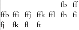
This is less than graceful, so type designers long ago came up with the solution of combining the fi and fl into single designs called ligatures. The standard set of ligatures consists of ff, ffi, ffl, fi, and fl. There are others in some typefaces, such as ft, fb (found in the word halfback, for example), and ij (used in setting Dutch).
Ligatures are cumbersome to implement in a word processing program like Microsoft Word. They’re also not a feature of the coding used for web pages and email, so you won’t see them in running text here. But they are a standard feature of an advanced page layout program such as Adobe InDesign.
Why does it matter? The same reason any number of minor subtleties matter in book design. Such niceties usually fall below the conscious notice of the reader; but taken together, they impart an overall sense of quality work. And the book connoisseur, such as a wholesale buyer or anyone in the book trade, is likely to notice if they’re not present. That could be the feather that tips the balance in the direction of not making the purchase.
It figures
One of the features of modern, high-quality Open Type fonts is the availability of different styles of figures, as shown here.
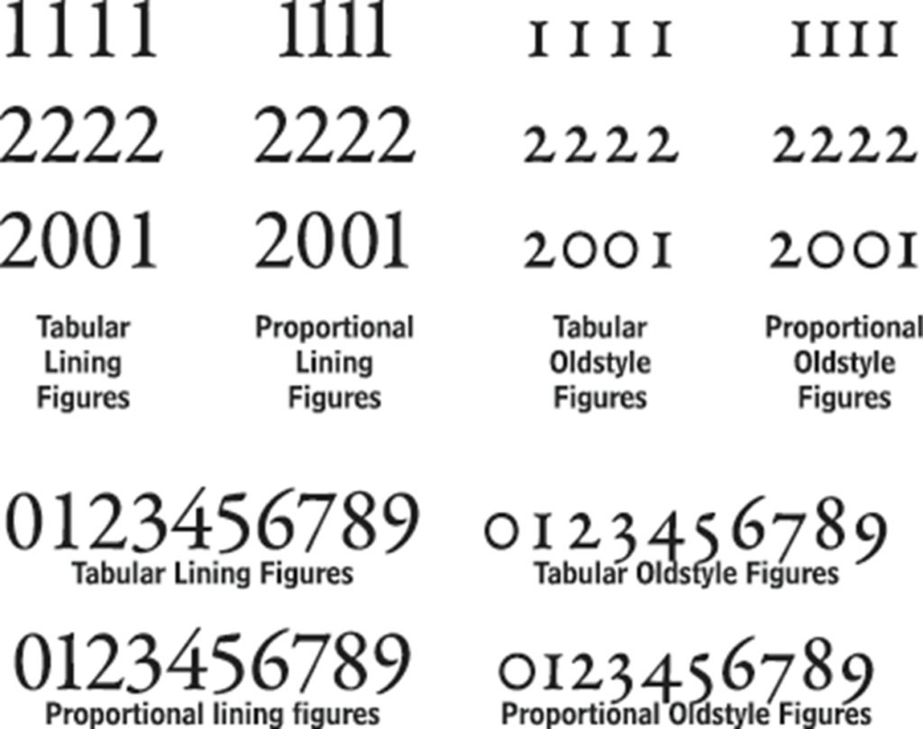
In designing a book, it’s typical to select which figures to use for different purposes based on the nature of the book. It would be typical in an engineering text, for example, to use lining figures, just as it would be typical in a history book—especially one with dates scattered about every page—to use oldstyle figures.
Tabular figures line up in columns, which is important when presenting numerical data in tables (including the table of contents, by the way). Tabular figures are also typically used for folios (page numbers). Proportional figures help maintain the even color within a block of running text.
A word about superscripts, subscripts, and fractions: These features are set with their own special sets of glyphs, and the design is almost always of the tabular lining variety. It’s generally a mistake, though, to use the full-size tabular lining figures and just scale them down and fiddle with the baseline. It’s always better to use the glyphs designed for the purpose, as they’ll be much more legible.