How many designers does it take?
No, not the lightbulb joke.
Many authors and publishers think that book design is all about the book cover. It isn’t. Creating a finished book involves six different design modalities:
- Book design focuses on the interior design framework and typography.
- Composition means laying out the pages and setting the type.
- Illustration encompasses infographics, interior artwork, and images.
- Cover illustration may involve original artwork or photography.
- Cover graphic design entails imagining and executing the front cover concept and type treatment.
- Cover production means turning the graphic design concept into finished files that are acceptable to the printer and that will result in the finished look you expect.
For some books, I do all of those. For other books, I’ll coordinate with an illustrator or graphic designer as needed. As the publisher, you should not assume that someone whose portfolio of book covers you like is also trained and skilled in book design and composition. Book design is its own discipline distinct from graphic design, and skilled practitioners are few and far between.

How I’ll design your book
The design of the book interior encompasses the selection of paper type, page size, margins, typefaces and sizes; and the detailed specification of typographic parameters and the arrangement of elements on the page.
Cover design consists of the selection of binding features and materials; the selection of artwork and the typographic design of front cover, back cover, and spine; and the editing and preparation of cover copy.
Design is an economic activity, in that the choices made affect the cost of composition and the cost of printing and binding. During the course of the design process, we’ll discuss the implications of alternate choices.
Unlike many designers, I do not limit the number of rounds of design revision. I want you to be delighted with the appearance of your book. Once we’ve settled on a design, you’ll sign off on it, and I can begin doing the layout. From that point forward, if you continue to make changes to the design parameters, I’ll charge for any rework caused by your changes.
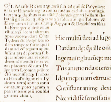
The heart of book design is typography
Typography is a design discipline, one that typically requires many years of study and a certain level of maturity before a practitioner can claim any level of expertise. Lots of graphic designers place type on a page, but that does not make them typographers any more than my getting dressed every morning makes me a fashion model. I started putting squiggly black marks on paper in an organized way more than six decades ago and have been studying the art ever since. Now I use colors and some of my pages are virtual, but I still work squarely within the boundaries of traditional typography.
The goal of good typography is to allow the unencumbered communication of the author’s meaning to the reader. Typography that intrudes its own cleverness and interferes with the dialogue between author and reader is almost always inappropriate.
The mechanics of typography have long been automated. Anyone who can use a computer can put type on a page. The question is whether the resulting page looks professional and serves its intended purpose effectively.
Appropriate typography
The essence of the typographer’s art is connotation, which is necessarily a subtle side note in the denotative world of words on a page. It is the typographer’s sensibilities about the cultural clues embodied in a font choice or a list style that enable the matching of design to content so seamlessly that the reader is drawn into the page rather than repulsed from it.
So while you, my potential client, may have a font you just love, I, as a typographer, have to judge which fonts best match the subject matter you’ve written about, the style of your prose, and the space budget for the project. And while you may have sketched out a rough design for a project, I have to apply what I know about readability and, more than that, the factors that affect reading comprehension.
What does that mean to you?
In the end, a design and a style of typesetting that are appropriate for a perfume ad in a fashion magazine have to be quite different from those of a textbook on the chemistry of fragrance. A scholarly text on theology should not look like either a modern romance or a software manual.
So you should not rely on cookie cutter solutions that apply the same design template to every book. You should work with a professional typographer who can develop an economical and appropriate approach to meeting your specific needs and deliver high-quality, accurate, on-time output.
I’m that professional.
learn more