For older posts, please visit the archived words / myth / ampers & virgule blog.

full view
grid view

Your paintings in print

You want your own artwork featured in your book. Maybe you’ve illustrated a children’s book. Maybe you’re a painter and you want to have a coffee table book. Maybe you’ve done just one fabulous painting for the cover. Whatever the case, this post is about getting your work in traditional media onto the printed page. If you have created your work in a digital medium to begin with, none of this applies to you.

Following these instructions will result in the best possible reproduction of your work at the least cost.*

  • Mount the unframed artwork on a vertical surface.
  • The room should be uniformly and brightly lit with “daylight” white (5000K) lights.
  • The camera should be mounted on an adjustable tripod.
  • The lens of the camera (look at the back of your phone and note that the lens is not geometrically centered on the phone body, so always measure from the actual lens) should be at the same height from the floor as the center of the artwork. Use a tape measure. Don’t guess.
  • The lens of the camera should be aligned left-to-right with the center of the artwork, on a line perpendicular to the wall. Use a carpenter’s square or the equivalent to establish the perpendicular line. Don’t guess.
  • The camera should be moved forward on that perpendicular line until the artwork almost (but not quite) fills the frame.
  • The photo should be taken at the camera’s highest resolution.

The camera will save the image in JPEG format. Once you have all the images in a folder, you can change their names from the simple sequence number the camera provides. You can change the name to a short title of the work, but you should also include a sequence number for where the work appears in the book: 001apple.jpg, 002bumblebeeEatingApple.jpg, 003catPlayingWithBumblebee.jpg. Note that there are no spaces in the example filenames. That’s a good practice to follow.

Do not, for the love of all that is holy, open the image in Photoshop or any other image editing program. Doing so, even for something as simple as cropping it to size, degrades the image when you resave it. JPEG is a “lossy” file format. Please just send the images, with their new names, to the designer (preferably me, of course). The designer will handle the image in a way that circumvents loss and will make any needed adjustments to the image.


* I did a coffee table book some years ago for an artist who promised me that she would provide digital photos of all her paintings taken by a famous photographer whose work hung in museums. Well, the famous photographer whose work hung in museums placed each painting in turn on a tilted easel twenty or so feet from the camera in a dark room and snapped a single photo with a handheld camera from some random angle. Boy, that was a fun job. Not. I should have charged more.

Balanced spreads

Kids these days!

By which I mean anyone younger than 65, apparently.

From 1454 to about 1984 or so, a span of approximately 530 years, the unit of book layout was a two-page spread in which, other than in special circumstances, facing pages balanced. That is to say, they had matching top and bottom margins. When type was made of metal, this convention was reinforced by the nature of the medium.

In the mid 1980s, computer-drive typesetting had evolved to the point that some systems were capable of pagination, rather than just spitting out long galley proofs that a human paste-up artist cut up into pages. (I did that for a few years.) However, the pagination algorithm wasn’t quite smart enough to produce balanced spreads on the first try. There was tweaking involved.

Seemingly, the generation of graphic artists who grew up with that technology never learned that balanced spreads were something desirable. And publishers’ production editors stopped expecting them. I’m fuzzy on which came first, but we’ve now reached a state of affairs in which the most popular layout program, Adobe InDesign, does not have a function for automating the ability to balance spreads. There’s no good reason it doesn’t; the function would be much easier to implement in the software than some of the other sophisticated features must have been. But hardly anyone now working in the field knows or cares enough, apparently, to demand that capability.

As a result, publishers, even major publishers that are household names, are churning out books in which there has clearly been no attempt to balance spreads or maintain a neat appearance at the bottoms of pages. I mean, sure, I do it, and so do at least some of my peers. But we’re a dying breed.

Kids these days!

AI handles a softball question better than I expected

You have probably been reading about AI and in particular about ChatGPT. And if you’ve been reading critically, you know that ChatGPT is prone to wildly fanciful speculation. So I’ve been avoiding it. But a friend posted something fun on Facebook, along with a signup link, and I said, Hey, what the heck. I signed up.

My friend’s challenge worked as expected, which is to say badly. The challenge was to enter “Please write a short biography (up to 3 paragraphs) for [YOUR NAME], who lives in [YOUR CITY, YOUR STATE].” I did that and learned all sorts of new facts about myself, none of which were true. Go ahead. Try it.

But then I decided to ask it to write a brief essay in response to this: “What is the difference between a book designer and a graphic designer?” [Spoiler: I’ve written about the difference many times in many places. I know the answer.] Here is ChatGPT’s first attempt at an answer:

While there can be overlap in their skills and responsibilities, there are distinct differences between a book designer and a graphic designer.

A book designer specializes in the design and layout of books, focusing on the visual presentation and organization of printed materials. They consider factors such as typography, page layout, cover design, and overall aesthetics to create a cohesive and visually appealing book. Book designers understand the intricacies of book production, including selecting appropriate typefaces, establishing a hierarchy of information, and ensuring readability. They work closely with authors, publishers, and printers to bring the book’s content to life in a visually pleasing and engaging manner.

On the other hand, a graphic designer has a broader scope of work and can be involved in various design disciplines. They may create visual designs for a wide range of media, including branding, marketing materials, websites, logos, packaging, and more. Graphic designers use their artistic skills, knowledge of design principles, and software proficiency to develop visually compelling and communicative designs. They often work on projects that require a strong understanding of branding, user experience, and visual communication across different mediums.

While both book designers and graphic designers share a foundation in design principles and aesthetics, their areas of specialization and the nature of their work differ. Book designers focus primarily on the specific requirements and considerations of book production, whereas graphic designers have a broader scope and can work on various design projects across different industries and mediums.

Not bad for a robot. But I wanted it to be more specific. So I asked this: “What are the risks of having a graphic designer design a book?” The response follows:

While graphic designers possess design skills that can be valuable in book design, there are certain risks involved when using a graphic designer to design a book. Some potential risks include:

  1. Lack of Book-specific Expertise: Graphic designers may not have a deep understanding of the unique considerations and technical aspects specific to book design. Books have their own requirements such as proper pagination, margins, gutter space, and chapter breaks. Without a comprehensive understanding of these elements, a graphic designer might overlook crucial aspects, resulting in a book that is visually inconsistent or difficult to read.
  2. Inadequate Typography Knowledge: Typography plays a crucial role in book design, affecting readability and aesthetics. While graphic designers are typically skilled in working with type, they may not have the specialized knowledge required for book typography. Issues such as appropriate typeface selection, leading, kerning, and ensuring consistency throughout the book can be overlooked, leading to a suboptimal reading experience.
  3. Insufficient Knowledge of Publishing Standards: Book production involves adhering to specific publishing standards and requirements. This includes understanding industry-standard file formats, color modes, image resolutions, and print specifications. If a graphic designer lacks knowledge of these standards, it can result in technical issues or printing problems that affect the quality of the final product.
  4. Limited Understanding of Narrative Flow: Book design involves considering the narrative flow and pacing of the content. It requires a keen eye for structuring chapters, integrating images or illustrations, and maintaining a consistent visual theme throughout the book. Graphic designers without experience in book design may not fully appreciate these considerations, potentially disrupting the reading experience or the intended impact of the book’s content.

To mitigate these risks, it is often advisable to collaborate with a professional book designer or someone with expertise in book design. They possess specialized knowledge and experience specific to book production, ensuring that the design aligns with industry standards, enhances readability, and supports the overall intent of the book.

The voice is flat and academic, but the content is thorough and accurate. On the one hand, this is scary as all get-out. On the other hand, it will be interesting to see how the public responds to the acres of blandness being spilled all over websites and media of all kinds. I hope I don’t find a lot of AI-generated text in manuscripts I edit. That would be disappointing.

I’m a bibliogonist

Today I learned, from dictionary.com’s word of the day, that bibliogony [ ˌbɪb liˈɒg ə ni ] is “the art of producing and publishing books.” I’ve been doing this for decades and never knew that word.

So it seems that I’m a bibliogonist (a word so rare that it doesn’t appear in dictionaries). And I just had my business cards reprinted. Darn.

Prelims, postlims, and plates: thinking like a printer

Some topics you may not have thought much about but that affect the way a book gets put together . . .


Prelims

Why do most books use lowercase Roman numerals (i, ii, iii, iv,  . . .) for the first several pages of a book before starting over with Arabic numerals (1, 2, 3, . . .)? Isn’t this old-fashioned? What’s wrong with just starting with page 1 as soon as you open the book?

There are practical reasons. Suppose your book has an index or that the text has cross-references (see page 39). Before a table of contents or an index can be written or a cross-reference resolved to a specific page number, the body of the book, beginning with the first chapter, has to be laid out and the page numbers locked in. As the body of the book is being laid out, it may be unknown whether the foreword you requested from your old professor is going to materialize, and in any case you don’t know how long it will be. You haven’t written the preface yet. The table of contents may be more than one page. In short, you don’t know how many preliminary pages (prelims, frontmatter) you’re going to end up with.

Furthermore, because of the way books are traditionally printed—on large sheets that get folded into signatures—you ideally want to wind up with a total page count that is a multiple of 16 or at worst a multiple of 8. While this constraint does not apply to print-on-demand digital books, which need only to be a multiple of 2 pages, it’s still a good idea to follow this guideline in case your book sells well and you later decide to order an offset press run. To stay within this guideline and minimize the number of blank pages, you may decide either add or delete some optional component of the prelims. (You might delete the bastard title—the half-title page preceding the title page—or move the acknowledgments or credits or author bio to the back of the book or add or delete pages of praise quotes.)

So the conventional way to keep all the page numbers correct in the main part of the book that starts on page 1 is to use lowercase Roman numbers for the prelims. Nothing about modern print production methods changes that.

Ebooks don’t have page numbers, so the question doesn’t come up in that context.


Folios

A printed page number is called a folio.

Some pages, such as the bastard title, the title page, the copyright page, blank pages, and a few others, do not have a printed page number. Those pages are still counted, but they are said to be blind-folioed.

The location of the folio is often at the top of the page for most pages but moved to the bottom of the page for the beginning of a chapter, say, or for some other special pages. When that is done, the result is called a drop folio. If all the folios are at the bottom, then there’s no special designation.


Postlims

Postlims (also backmatter, endmatter, endlims) are the bits that come after “THE END”: appendices, references, endnotes, index, etc. Back when books were printed from metal plates, there were some types of books that were updated periodically (reference works of various sorts) with appendices that never changed. Rather than make new plates for a simple page number change, the printers of such books had the option of a separate numbering convention for the postlims. Nowadays, there is no reason to do that, and the practice has entirely disappeared. Page numbers just continue from the last page of the main text.


Plates

Many books have a clump of pages in some seemingly random location where all of the images are gathered (whether those images are in color or black-and-white). Maybe those pages are printed on a different paper from the text-only pages the precede and follow.

This practice developed in an earlier era, when printing images involved different technologies than printing text. The papers used for most text printing were okay for woodcuts and coarse line drawings, but they did not work as well for fine engravings or for photographic images. It made sense for printers to use more expensive paper (and more experienced press operators) for these, and so they were printed as separate signatures. When this was done, each page was called a plate, and the plates were numbered independently of the text pages, often in uppercase Roman numerals. When the book was assembled, the signature of plates might follow page 96, say, and the next page after the plate XVI would then be page 97.

Nowadays, with modern offset printing and digital printing and modern, high-quality papers, this practice is hardly ever used. There are some cases—specific books from specific publishers—for which it still makes economic sense. So the practice has not entirely disappeared. But in general, your book will be more enjoyable for the reader if the images are printed where they belong in the flow of your text, interspersed as needed, printed on the same paper. Depending on the number of books you are having printed, there may be some strategizing about the placement of color images, but printing them as separate plates is unlikely to be the solution.

Writing a great book isn’t enough

You have written a great book, and now an adoring public is going to make you famous. What’s missing from this picture? What’s missing is this piece: How does the public know you’ve written a book?

If you are planning to give your book away to friends and family, customers, or sales prospects, or if you will be hand-selling your book to people who come to hear you speak, then you can ignore this post. This post is for authors who want to sell books to a public that doesn’t already know them.

So if you’re still with me, I’m going to say a few words about a dreaded topic: marketing.

One of the very first questions I ask of an author who comes to me for my help in publishing their book is a broad description of how they plan to market the book. I’m not a marketing consultant and have no plans to become one. But I want to know that there is some plausible scheme in place for connecting with an audience. Spoiler: “I’ll list it on Amazon and people will discover it” is not a marketing plan. Listing a book so the people looking for it can find it and buy it is good. But first people need to be looking for it.

I know, I know. You hate that word. It sounds so crass. But marketing is at the heart of what it means to publish a book—literally to make it public. The publisher’s job is to make a connection between the book and the audience for the book. And the author is the one person in a position to facilitate that connection.

Perhaps you’re one of the fortunate authors who has secured representation by a literary agent and that agent has managed to get you a publishing contract. Congratulations. But the publisher is still going to require that you be heavily engaged in promoting the book. On the other hand, if you are publishing the book independently, you’re still going to require that the author (you) be heavily engaged in promoting the book. This is true whether you work with someone like me or succumb to the blandishments of a vanity press. I’ll make your book, but you’re going to market it.

I can refer you to a book marketing consultant who will work with you to develop a marketing plan, if that’s something you want to consider. But you’re still the person who is going to have to execute that plan. The marketing consultant can’t do that for you, and neither can I. What that means nowadays for the vast majority of books intended for public consumption is that you—the author, personally—need to be visible on social media. If that phrase sends shivers down your spine and you’re unwilling to find a platform you can get comfortable with, you’re going to have a hard time selling books.

Every year, thousands of excellent books are written that never sell more than ten copies, let alone a hundred or a thousand. The authors of those books didn’t think they needed to market them. They were wrong.

Lines and pixels and dots, oh my!

Lines per inch, dots per inch, pixels per inch. Don’t those all mean the same thing? 

No. They don’t.

But you will find many examples of people saying dots per inch when they mean pixels per inch. I’ve probably done it myself. So how should you understand these three terms.

A pixel (from PICture ELement) is a tiny rectangular area of an image on your computer or phone screen. Now the real world is not divided into tiny rectangular elements. The real world is smoother than that. And the color of what you see in the real world may vary across that tiny area. But digital cameras and scanners average the real-world color across that area and arrive at a value that is some percentage of the maximum value of each of the primary colors red, green, and blue.

In modern computer systems, it’s convenient to divide data into eight-bit bytes. Eight binary bits are sufficient to express integers from 0 to 255. So if we give red a byte and green a byte and blue a byte (a common scheme, called 24-bit color), we can express 256 × 256 × 256 = 16,777,216 colors. (There are other schemes using more bytes that can express even more colors, but its arguable that the human eye’s ability to distinguish that many colors is already marginal. I digress. You may have noticed.)

So, again, the camera or scanner looks at a tiny region of the real world, averages the color, and comes up with a number that tells a display device how much voltage to energize the red, green, and blue components of a pixel with. And that’s fine for viewing an image on a screen.

But a printing press (or a laser printer or an inkjet printer) is not a screen, and it doesn’t divide the world into pixels. It uses dots.

Since the main purpose of printing is to render type, not images, I’ll start there. A dot either has ink (or toner) or it doesn’t. There are no levels of gray. There are only black and white (and cyan and white, magenta and white,and yellow and white, but we’ll get to those in a minute). On or off. Period.

Modern electronic printing technology typically uses a standard of 2,540 dots per inch (that’s 100 dots per millimeter if you’re wondering why the strange-looking number). So a character that is rendered at, say, 120 pixels per inch on your screen is rendered with dots that are one-twentieth the size of one of those screen pixels, so the curve of a letter C or O looks quite smooth, even if you look at it under moderate magnification. The same is true for a line on  a graph or an outline in a coloring book. The trick of anti-aliasing type on screen by having some pixels along the edges in various shades of gray instead of black is not needed (and not possible) on a printing press. Remember: ink or no ink. Black or white. Not 256 or even 16 levels of gray, not 16,777,216 colors.

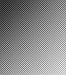
So how does a black-and-white image (a picture, as opposed to type or a vector diagram) get printed? It begins with a halftone screen. This is an old analog technology that is modeled in modern image-processing software. In the analog world, a photo was placed on a copy board, and a photograph was taken of that photo with a piece of ruled film in front of the new film that was to be exposed. The rulings on the face of the film (the halftone screen) caused the light reflected from the image being photographed to diffract on the way through the thickness of the screen, producing halftone dots on the new film. Those dots were proportionate in area to the amount of light coming through that particular rectangle on the screen. So the dots varied in size. If you stood far enough away from the photo, it did not look like a rectangular array of oval dots; it looked like a continuous tone image, like the original. The spacing of the rulings on the screen determined the quality of the printed image. A newspaper might have used an 85-line screen, that is, a screen with 85 lines per inch. A weekly magazine or a history book might have used a 110- or 133-line screen (133 being considered good quality). A monthly might have used a 150-line screen. I think National Geographic used 175, and some art book printers used 200 lines per inch. At 150 lines per inch, a halftone dot occupies an area 16 printer dots square, any fraction of which can carry ink. But if you look at any halftone image, either black-and-white or color, under a magnifying glass, you can clearly see the halftone dots, in all their various combinations of sizes and grid orientations, that make up the image. (If you don’t want to squint through a magnifying glass, you can just look at paintings by Chuck Close, who exploited the halftone illusion in his wall-size portraits.)

And modern electronic images are printed the same way. Software converts the pixels with their millions of red-green-blue (RGB) values to halftone dots in their different sizes and orientations of cyan, magenta, yellow, and black (CMYK) sizes. (RGB are transmissive primary colors; their complements, CMY, are reflective primary colors.) If you look through a magnifier at a comic strip or at, say, a chart with tinted areas, you’ll see round dots. Those work pretty much the same way as halftones, inasmuch as the intensity of the color you see correlates with the percentage of the paper surface covered with ink. But those dots are generated from equations, not by processing an image with a screen. Those  dots have an interesting history, if you want a diversion. You may also be familiar with them in another context: paintings by Roy Lichtenstein.

When is a hardcover not a hardcover?

Maybe you’ve seen yesterday’s feature posted by the New York Times Book Review titled “How a Book Is Made: Ink, Paper, and a 200,000-Pound Printer.” If you’re not a subscriber, this link may no longer work for you by the time you come across this post. If that’s the case, don’t worry; you didn’t miss much.

First of all, who calls a printing press “a 200,000-pound printer”? I guess the headline writer was trying to be cute. Whatever.

Anyway, here’s the comment I submitted. There were already 346 comments posted, and I didn’t read them all, nor do I expect you to.

When the New York Times says “book,” they mean a bestselling book from a major publisher. Most books are not produced on equipment of this scale. Your book, dear reader, unless the Book Review has featured it, wasn’t and won’t be.

That said, this article is selling the idea that an adhesive-case book—the kind being bound here—is what we should think of when we hear “hardcover.” It isn’t. This is the type of book sold in chain bookstores, big box stores, and airports. But it is really nothing more than a perfectbound softcover book with a thicker cover. It won’t open flat any better than a paperback, because it is made the same way, with the pages glued to a backing. The great advantage of this kind of binding is that the publisher can call it a hardcover and demand a price premium from the unsuspecting public they foist these cheaply made books on.

A proper hardcover, the kind this knockoff is pretending to be, is a sewn case book. The signatures, after being folded, are sewn together so that the book can open flat at any page. A sewn case book can last through hundreds of readings without the pages falling out or the spine cracking or a frustrated reader throwing it against a wall because it won’t lie flat.

There are still craftspeople in the world who care about turning out quality books. And there are still publishers who support them.

I’m a book designer. I try to steer my clients away from these faux hardcovers. So far I’ve been successful in doing so.

Book manufacturers offer a variety of binding types, and the choice often depends on the size and weight of the book as well as the number of copies to be printed and the channels where the book will be sold. Part of my job is understanding what the variables are and making good choices for my clients’ books.

Three common misconceptions about self-publishing

You will find—have probably already found—a great deal of advice and information floating around the Web. Some of it is great. Some of it is okay. Some of it is just wrong and can lead you well astray of the path you want to be on. Here are three of the biggest false beliefs I encounter. This is by no means all or even most of the myths that are out there. But these are major ones.


1. Printing a book is publishing a book

Publishing a book is making it available to the public. You may be interested in selling the book at a profit, as most publishers are. Or you may just want to get the word out there. But the key is that you’re making it public.

You may not be interested in selling books or indeed in making your book public. You may, instead, want to end up with a privately printed book that you can give away to your family and friends, to your clients and prospects, to your customers and employees. From a production standpoint, almost all the steps to produce the book are the same (you don’t need to create a publishing imprint or buy ISBNs, and you may decide to forgo registering the copyright).

But if you are publishing the book, then you need to attend to working out a marketing plan and executing that plan (often the tail that wags the dog), dealing with the various bureaucratic requirements of establishing a publishing business (even if this is the only book you’ll ever publish), and keeping good records.

Before you seek services to help you reach your goal, have clear in your mind whether you are publishing a book or just making a book that you are not publishing. If you are publishing a book, then you are a publisher. You can drop the “self” part whenever you feel ready to do so.

Here is a Venn diagram that shows the relationship between making books and publishing books.

Venn diagram. Two overlapping sets: printed things and published things. Some kinds of books are printed but not published. Some published things are not books.
 

2. It’s not self-publishing unless I do it all myself

Self-publishing does not mean do-it-yourself publishing. Yes, it’s fun to learn new skills. But doing anything well requires training and experience. Producing a book is no different in that regard from any other kind of craft activity. You can find all sorts of advice on the Web and books in the bookstore on how to put out a DIY book, and if you have zero budget, you can do that. But don’t expect it to win awards for production values.

If you are the publisher, then think like a publisher. Decide what level of quality you want in the finished product. Figure out what aspects of the overall publishing process you have the needed skills for (as well as the time to do them). Figure out which aspects you would do well to hire a craft expert for. Can you edit your own book? Maybe, if you’re an experienced editor and are able to do what most editors cannot do, which is to edit your own work. But if you have no training or experience as an editor, this is not a good practice. Can you do your own interior book design and typesetting? Maybe you can find a template and do a passable job, and maybe that will be good enough for your purposes. But if you are planning to have a book that people admire, you should probably hire a professional book designer. Can you cobble together a cover from a template? Maybe. But most people will advise you to hire a graphic designer for the cover.

You’re no less a self-publisher for hiring professionals to do the craft work of producing your book. You don’t have to do that work yourself. You have enough work to do to market the book.

Here’s a flowchart showing the main steps in producing a book. See how much of it you want to take on yourself.

Be the publisher wall chart. Flow chart of book production process.

(A high-resolution 18ʺ × 24ʺ poster is available at andslash.com.)
 

3. If I want to be successful, I have to use a self-publishing company

Think about that for a minute. The very term self-publishing company is an oxymoron. You are the only “self” involved. The company that wants your money is not the self. And they’re not putting money at risk. So they’re not the publisher, either. They are simply a vehicle for siphoning off any possible profits for themselves after you’ve paid the full cost of producing the book.

And what are they going to do in exchange? They’re going to upload your book to Amazon (something you can do yourself for free), and they’re going to post a thumbnail of your book cover on their own website, which is a place no one—NO ONE—thinks of first when they want to buy a book.

Are they going to connect you with highly skilled editors and designers? You have no guarantee of that and no control over who they select. You can do much better on your own.

And their “marketing services” do not include any actual marketing. You’re still on your own for that. As the publisher, you’re responsible for connecting with the audience for the book and telling them where they can purchase it. Any money you pay to a vanity press for marketing just goes straight into their pocket, with nothing to show for it.
 

Bottom line

If you’re self-publishing, be the publisher. Work with skilled professionals to produce the book you want. Take off your author hat and put on your publisher hat. Think like a business person. Work collegially with your team. And don’t quit your day job.

Say, neighbor, can I borrow your paper stretcher?

Writing is an intensely cerebral activity, so much so that sometimes an author—perhaps even you—becomes so lost in abstract thought that they lose track of the idea that what they’re trying to produce is a physical object that can be held in the hand, namely a book.

And it’s the physicality of the book that sometimes creates a problem. One of the first elements to be decided in designing a book is how large the page is going to be. For some types of books, the answer is either a given or is limited to a small number of conventional choices if the publisher is going to have any chance of staying within a production budget. As an author, if your book contains tables or illustrations, you need to be aware of that page size. This is true throughout the design conversation, right up until the final stage of page layout.

Why does it matter? you ask. It matters because the complex diagram you’ve constructed may be suitable for a wall poster but may not be readable if it’s reduced to the space available on your book page. And if it has to be readable on your book page, yer gonna need a bigger boat, er, book.

Because paper doesn’t stretch, much as we might wish that it did.

New year’s resolution

Covers are on my mind. Book covers, specifically.

You want your book to have a cover that stands out from the crowd, especially if you are competing for eyes in a retail environment. So it’s understandable that you might want to hire a graphic designer who specializes in book covers in your genre. You won’t hurt my feelings if you hire me for your book interior and hire someone else for your cover. But being a creative genius with a brilliant idea for your cover is not necessarily correlated with an understanding of how that cover is going to be printed. Graphic designers are artists, not engineers.

A client recently sent me a cover that another designer created. There were several reasons the cover couldn’t be used, but the main one was resolution.

The type was rendered as an image at 300 dpi. Enlarged, it looks like this.


There are two problems here. An important one is that what started out as characters typed on a keyboard is now rendered as pixels. So if there’s a typo, there isn’t a good way to correct it. The other, though, is that at normal human visual acuity, type with fuzzy edges is fatiguing to read.

I rebuilt the cover in InDesign. Now the type looks like this:


The type is sharp. And it’s editable.

As I said, this isn’t the only issue with a cover built in Photoshop. Another is that the final step before sending files to a printer is adjusting the width of the book’s spine. The reason is that different printers have slightly different specs. The choice of printer may be made at the last minute, and there may be more than one printer who will be manufacturing the book, depending on the number of sales channels the publisher is using. Adjusting the spine width in Photoshop means changing the overall dimensions of the image and aligning the spine type quite precisely. This necessitates at least one round trip exchange with the graphic designer (usually two or three because of the imprecision inherent in sliding elements around in Photoshop). In InDesign, changing the spine width is trivial.

Bottom line, if you want to hire a separate cover designer, go ahead and do that. But ascertain beforehand what kind of file they’re going to deliver and whether they’ll be around for edits and tweaks if needed. And don’t accept an image file if you want text to be easy to read.

Comma—chameleon

This is a brief technical essay for editors. Writers are free to listen in.

Why do we argue, er, debate, er, discuss commas so often? Why do we mostly all agree about one comma and have widely divergent views about another comma? (Okay, there are only three possible views for any given comma: needed, forbidden, and optional; so maybe “widely divergent” is the wrong formulation.) Why do editors insist on the rightness of their view?

Relax. There’s room for more than one approach, and readers adapt smoothly and without confusion. You will be a better editor if you acknowledge that there are different ways to approach comma usage that are equally valid.

Consider: We understand that the ur-comma was a breath mark, pure and simple. It was an aid to the lector, when few were literate and reading was done from the pulpit. But also remember that some modern writing is meant to be read aloud, whether to children or to a theater audience or at a poetry slam.

I recall an interview on NPR with Robert Alter, when he was still working on his translation of Genesis or perhaps when he had just completed it. The phrase that struck me, as he was explaining his frequent use of repetition and reduplication, was that “some people read with their eyes, and some people read with their ears.”

So that’s one axis: Do you use commas strictly analytically (following formal rules), or do you use them to guide the reader in the intended prosody of the sentence? Obviously, you want to have one consistent approach in a given text, and if you only ever edit that same kind of text (academic work in the humanities, say), then you will always use the same approach. But other kinds of texts may benefit from using a different approach.

Now let’s look at the other axis, which extends from close punctuation (close-p) to open punctuation (open-p). Close-p is characterized by more punctuation in general than open-p, more commas and more semicolons, in particular. Open-p is characterized by a minimalist approach to commas, semicolons, and colons. If it is has more of anything, that would be the dash.

I’ve taken a stab (based on pure guesswork, mind you) at placing various sorts of prose on this plane I’ve defined. You might place them differently or think of better examples, and that’s fine.

My main point is that all of these exist in the world, and chaos has not ensued. So saying, as some editors are wont, that style guide A or style guide B is the gospel handed down from above and all other possible approaches are wrong does not seem productive to me.

What makes sense to me is to realize that all of these styles are valid in specific contexts and that to the extent an editor can let go of the idea that one style is better than another in some absolute sense and can instead embrace the idea of choosing a punctuation style that suits the text at hand, that person becomes a better, more versatile editor.

We can still use analysis to describe the reason for using or omitting a particular comma, but we can do it in the context of understanding the range of possible styles.