Lines per inch, dots per inch, pixels per inch. Don’t those all mean the same thing?
No. They don’t.
But you will find many examples of people saying dots per inch when they mean pixels per inch. I’ve probably done it myself. So how should you understand these three terms.
A pixel (from PICture ELement) is a tiny rectangular area of an image on your computer or phone screen. Now the real world is not divided into tiny rectangular elements. The real world is smoother than that. And the color of what you see in the real world may vary across that tiny area. But digital cameras and scanners average the real-world color across that area and arrive at a value that is some percentage of the maximum value of each of the primary colors red, green, and blue.
In modern computer systems, it’s convenient to divide data into eight-bit bytes. Eight binary bits are sufficient to express integers from 0 to 255. So if we give red a byte and green a byte and blue a byte (a common scheme, called 24-bit color), we can express 256 × 256 × 256 = 16,777,216 colors. (There are other schemes using more bytes that can express even more colors, but its arguable that the human eye’s ability to distinguish that many colors is already marginal. I digress. You may have noticed.)
So, again, the camera or scanner looks at a tiny region of the real world, averages the color, and comes up with a number that tells a display device how much voltage to energize the red, green, and blue components of a pixel with. And that’s fine for viewing an image on a screen.
![]() But a printing press (or a laser printer or an inkjet printer) is not a screen, and it doesn’t divide the world into pixels. It uses dots.
But a printing press (or a laser printer or an inkjet printer) is not a screen, and it doesn’t divide the world into pixels. It uses dots.
Since the main purpose of printing is to render type, not images, I’ll start there. A dot either has ink (or toner) or it doesn’t. There are no levels of gray. There are only black and white (and cyan and white, magenta and white,and yellow and white, but we’ll get to those in a minute). On or off. Period.
Modern electronic printing technology typically uses a standard of 2,540 dots per inch (that’s 100 dots per millimeter if you’re wondering why the strange-looking number). So a character that is rendered at, say, 120 pixels per inch on your screen is rendered with dots that are one-twentieth the size of one of those screen pixels, so the curve of a letter C or O looks quite smooth, even if you look at it under moderate magnification. The same is true for a line on a graph or an outline in a coloring book. The trick of anti-aliasing type on screen by having some pixels along the edges in various shades of gray instead of black is not needed (and not possible) on a printing press. Remember: ink or no ink. Black or white. Not 256 or even 16 levels of gray, not 16,777,216 colors.
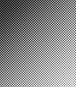 So how does a black-and-white image (a picture, as opposed to type or a vector diagram) get printed? It begins with a halftone screen. This is an old analog technology that is modeled in modern image-processing software. In the analog world, a photo was placed on a copy board, and a photograph was taken of that photo with a piece of ruled film in front of the new film that was to be exposed. The rulings on the face of the film (the halftone screen) caused the light reflected from the image being photographed to diffract on the way through the thickness of the screen, producing halftone dots on the new film. Those dots were proportionate in area to the amount of light coming through that particular rectangle on the screen. So the dots varied in size. If you stood far enough away from the photo, it did not look like a rectangular array of oval dots; it looked like a continuous tone image, like the original. The spacing of the rulings on the screen determined the quality of the printed image. A newspaper might have used an 85-line screen, that is, a screen with 85 lines per inch. A weekly magazine or a history book might have used a 110- or 133-line screen (133 being considered good quality). A monthly might have used a 150-line screen. I think National Geographic used 175, and some art book printers used 200 lines per inch. At 150 lines per inch, a halftone dot occupies an area 16 printer dots square, any fraction of which can carry ink. But if you look at any halftone image, either black-and-white or color, under a magnifying glass, you can clearly see the halftone dots, in all their various combinations of sizes and grid orientations, that make up the image. (If you don’t want to squint through a magnifying glass, you can just look at paintings by Chuck Close, who exploited the halftone illusion in his wall-size portraits.)
And modern electronic images are printed the same way. Software converts the pixels with their millions of red-green-blue (RGB) values to halftone dots in their different sizes and orientations of cyan, magenta, yellow, and black (CMYK) sizes. (RGB are transmissive primary colors; their complements, CMY, are reflective primary colors.) If you look through a magnifier at a comic strip or at, say, a chart with tinted areas, you’ll see round dots. Those work pretty much the same way as halftones, inasmuch as the intensity of the color you see correlates with the percentage of the paper surface covered with ink. But those dots are generated from equations, not by processing an image with a screen. Those dots have an interesting history, if you want a diversion. You may also be familiar with them in another context: paintings by Roy Lichtenstein.