For older posts, please visit the archived words / myth / ampers & virgule blog.

full view
grid view

I’m a bibliogonist

Today I learned, from dictionary.com’s word of the day, that bibliogony [ ˌbɪb liˈɒg ə ni ] is “the art of producing and publishing books.” I’ve been doing this for decades and never knew that word.

So it seems that I’m a bibliogonist (a word so rare that it doesn’t appear in dictionaries). And I just had my business cards reprinted. Darn.

Prelims, postlims, and plates: thinking like a printer

Some topics you may not have thought much about but that affect the way a book gets put together . . .


Prelims

Why do most books use lowercase Roman numerals (i, ii, iii, iv,  . . .) for the first several pages of a book before starting over with Arabic numerals (1, 2, 3, . . .)? Isn’t this old-fashioned? What’s wrong with just starting with page 1 as soon as you open the book?

There are practical reasons. Suppose your book has an index or that the text has cross-references (see page 39). Before a table of contents or an index can be written or a cross-reference resolved to a specific page number, the body of the book, beginning with the first chapter, has to be laid out and the page numbers locked in. As the body of the book is being laid out, it may be unknown whether the foreword you requested from your old professor is going to materialize, and in any case you don’t know how long it will be. You haven’t written the preface yet. The table of contents may be more than one page. In short, you don’t know how many preliminary pages (prelims, frontmatter) you’re going to end up with.

Furthermore, because of the way books are traditionally printed—on large sheets that get folded into signatures—you ideally want to wind up with a total page count that is a multiple of 16 or at worst a multiple of 8. While this constraint does not apply to print-on-demand digital books, which need only to be a multiple of 2 pages, it’s still a good idea to follow this guideline in case your book sells well and you later decide to order an offset press run. To stay within this guideline and minimize the number of blank pages, you may decide either add or delete some optional component of the prelims. (You might delete the bastard title—the half-title page preceding the title page—or move the acknowledgments or credits or author bio to the back of the book or add or delete pages of praise quotes.)

So the conventional way to keep all the page numbers correct in the main part of the book that starts on page 1 is to use lowercase Roman numbers for the prelims. Nothing about modern print production methods changes that.

Ebooks don’t have page numbers, so the question doesn’t come up in that context.


Folios

A printed page number is called a folio.

Some pages, such as the bastard title, the title page, the copyright page, blank pages, and a few others, do not have a printed page number. Those pages are still counted, but they are said to be blind-folioed.

The location of the folio is often at the top of the page for most pages but moved to the bottom of the page for the beginning of a chapter, say, or for some other special pages. When that is done, the result is called a drop folio. If all the folios are at the bottom, then there’s no special designation.


Postlims

Postlims (also backmatter, endmatter, endlims) are the bits that come after “THE END”: appendices, references, endnotes, index, etc. Back when books were printed from metal plates, there were some types of books that were updated periodically (reference works of various sorts) with appendices that never changed. Rather than make new plates for a simple page number change, the printers of such books had the option of a separate numbering convention for the postlims. Nowadays, there is no reason to do that, and the practice has entirely disappeared. Page numbers just continue from the last page of the main text.


Plates

Many books have a clump of pages in some seemingly random location where all of the images are gathered (whether those images are in color or black-and-white). Maybe those pages are printed on a different paper from the text-only pages the precede and follow.

This practice developed in an earlier era, when printing images involved different technologies than printing text. The papers used for most text printing were okay for woodcuts and coarse line drawings, but they did not work as well for fine engravings or for photographic images. It made sense for printers to use more expensive paper (and more experienced press operators) for these, and so they were printed as separate signatures. When this was done, each page was called a plate, and the plates were numbered independently of the text pages, often in uppercase Roman numerals. When the book was assembled, the signature of plates might follow page 96, say, and the next page after the plate XVI would then be page 97.

Nowadays, with modern offset printing and digital printing and modern, high-quality papers, this practice is hardly ever used. There are some cases—specific books from specific publishers—for which it still makes economic sense. So the practice has not entirely disappeared. But in general, your book will be more enjoyable for the reader if the images are printed where they belong in the flow of your text, interspersed as needed, printed on the same paper. Depending on the number of books you are having printed, there may be some strategizing about the placement of color images, but printing them as separate plates is unlikely to be the solution.

Lines and pixels and dots, oh my!

Lines per inch, dots per inch, pixels per inch. Don’t those all mean the same thing? 

No. They don’t.

But you will find many examples of people saying dots per inch when they mean pixels per inch. I’ve probably done it myself. So how should you understand these three terms.

A pixel (from PICture ELement) is a tiny rectangular area of an image on your computer or phone screen. Now the real world is not divided into tiny rectangular elements. The real world is smoother than that. And the color of what you see in the real world may vary across that tiny area. But digital cameras and scanners average the real-world color across that area and arrive at a value that is some percentage of the maximum value of each of the primary colors red, green, and blue.

In modern computer systems, it’s convenient to divide data into eight-bit bytes. Eight binary bits are sufficient to express integers from 0 to 255. So if we give red a byte and green a byte and blue a byte (a common scheme, called 24-bit color), we can express 256 × 256 × 256 = 16,777,216 colors. (There are other schemes using more bytes that can express even more colors, but its arguable that the human eye’s ability to distinguish that many colors is already marginal. I digress. You may have noticed.)

So, again, the camera or scanner looks at a tiny region of the real world, averages the color, and comes up with a number that tells a display device how much voltage to energize the red, green, and blue components of a pixel with. And that’s fine for viewing an image on a screen.

But a printing press (or a laser printer or an inkjet printer) is not a screen, and it doesn’t divide the world into pixels. It uses dots.

Since the main purpose of printing is to render type, not images, I’ll start there. A dot either has ink (or toner) or it doesn’t. There are no levels of gray. There are only black and white (and cyan and white, magenta and white,and yellow and white, but we’ll get to those in a minute). On or off. Period.

Modern electronic printing technology typically uses a standard of 2,540 dots per inch (that’s 100 dots per millimeter if you’re wondering why the strange-looking number). So a character that is rendered at, say, 120 pixels per inch on your screen is rendered with dots that are one-twentieth the size of one of those screen pixels, so the curve of a letter C or O looks quite smooth, even if you look at it under moderate magnification. The same is true for a line on  a graph or an outline in a coloring book. The trick of anti-aliasing type on screen by having some pixels along the edges in various shades of gray instead of black is not needed (and not possible) on a printing press. Remember: ink or no ink. Black or white. Not 256 or even 16 levels of gray, not 16,777,216 colors.

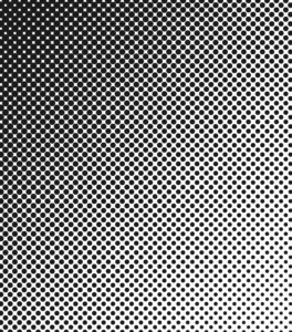
So how does a black-and-white image (a picture, as opposed to type or a vector diagram) get printed? It begins with a halftone screen. This is an old analog technology that is modeled in modern image-processing software. In the analog world, a photo was placed on a copy board, and a photograph was taken of that photo with a piece of ruled film in front of the new film that was to be exposed. The rulings on the face of the film (the halftone screen) caused the light reflected from the image being photographed to diffract on the way through the thickness of the screen, producing halftone dots on the new film. Those dots were proportionate in area to the amount of light coming through that particular rectangle on the screen. So the dots varied in size. If you stood far enough away from the photo, it did not look like a rectangular array of oval dots; it looked like a continuous tone image, like the original. The spacing of the rulings on the screen determined the quality of the printed image. A newspaper might have used an 85-line screen, that is, a screen with 85 lines per inch. A weekly magazine or a history book might have used a 110- or 133-line screen (133 being considered good quality). A monthly might have used a 150-line screen. I think National Geographic used 175, and some art book printers used 200 lines per inch. At 150 lines per inch, a halftone dot occupies an area 16 printer dots square, any fraction of which can carry ink. But if you look at any halftone image, either black-and-white or color, under a magnifying glass, you can clearly see the halftone dots, in all their various combinations of sizes and grid orientations, that make up the image. (If you don’t want to squint through a magnifying glass, you can just look at paintings by Chuck Close, who exploited the halftone illusion in his wall-size portraits.)

And modern electronic images are printed the same way. Software converts the pixels with their millions of red-green-blue (RGB) values to halftone dots in their different sizes and orientations of cyan, magenta, yellow, and black (CMYK) sizes. (RGB are transmissive primary colors; their complements, CMY, are reflective primary colors.) If you look through a magnifier at a comic strip or at, say, a chart with tinted areas, you’ll see round dots. Those work pretty much the same way as halftones, inasmuch as the intensity of the color you see correlates with the percentage of the paper surface covered with ink. But those dots are generated from equations, not by processing an image with a screen. Those  dots have an interesting history, if you want a diversion. You may also be familiar with them in another context: paintings by Roy Lichtenstein.

When is a hardcover not a hardcover?

Maybe you’ve seen yesterday’s feature posted by the New York Times Book Review titled “How a Book Is Made: Ink, Paper, and a 200,000-Pound Printer.” If you’re not a subscriber, this link may no longer work for you by the time you come across this post. If that’s the case, don’t worry; you didn’t miss much.

First of all, who calls a printing press “a 200,000-pound printer”? I guess the headline writer was trying to be cute. Whatever.

Anyway, here’s the comment I submitted. There were already 346 comments posted, and I didn’t read them all, nor do I expect you to.

When the New York Times says “book,” they mean a bestselling book from a major publisher. Most books are not produced on equipment of this scale. Your book, dear reader, unless the Book Review has featured it, wasn’t and won’t be.

That said, this article is selling the idea that an adhesive-case book—the kind being bound here—is what we should think of when we hear “hardcover.” It isn’t. This is the type of book sold in chain bookstores, big box stores, and airports. But it is really nothing more than a perfectbound softcover book with a thicker cover. It won’t open flat any better than a paperback, because it is made the same way, with the pages glued to a backing. The great advantage of this kind of binding is that the publisher can call it a hardcover and demand a price premium from the unsuspecting public they foist these cheaply made books on.

A proper hardcover, the kind this knockoff is pretending to be, is a sewn case book. The signatures, after being folded, are sewn together so that the book can open flat at any page. A sewn case book can last through hundreds of readings without the pages falling out or the spine cracking or a frustrated reader throwing it against a wall because it won’t lie flat.

There are still craftspeople in the world who care about turning out quality books. And there are still publishers who support them.

I’m a book designer. I try to steer my clients away from these faux hardcovers. So far I’ve been successful in doing so.

Book manufacturers offer a variety of binding types, and the choice often depends on the size and weight of the book as well as the number of copies to be printed and the channels where the book will be sold. Part of my job is understanding what the variables are and making good choices for my clients’ books.