Kids these days!
By which I mean anyone younger than 65, apparently.
From 1454 to about 1984 or so, a span of approximately 530 years, the unit of book layout was a two-page spread in which, other than in special circumstances, facing pages balanced. That is to say, they had matching top and bottom margins. When type was made of metal, this convention was reinforced by the nature of the medium.
In the mid 1980s, computer-drive typesetting had evolved to the point that some systems were capable of pagination, rather than just spitting out long galley proofs that a human paste-up artist cut up into pages. (I did that for a few years.) However, the pagination algorithm wasn’t quite smart enough to produce balanced spreads on the first try. There was tweaking involved.
Seemingly, the generation of graphic artists who grew up with that technology never learned that balanced spreads were something desirable. And publishers’ production editors stopped expecting them. I’m fuzzy on which came first, but we’ve now reached a state of affairs in which the most popular layout program, Adobe InDesign, does not have a function for automating the ability to balance spreads. There’s no good reason it doesn’t; the function would be much easier to implement in the software than some of the other sophisticated features must have been. But hardly anyone now working in the field knows or cares enough, apparently, to demand that capability.
As a result, publishers, even major publishers that are household names, are churning out books in which there has clearly been no attempt to balance spreads or maintain a neat appearance at the bottoms of pages. I mean, sure, I do it, and so do at least some of my peers. But we’re a dying breed.
Kids these days!
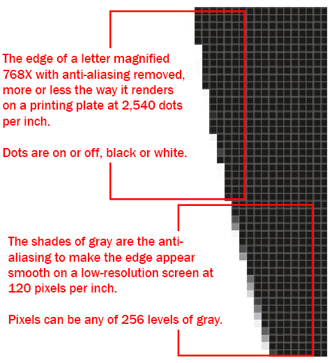 But a printing press (or a laser printer or an inkjet printer) is not a screen, and it doesn’t divide the world into pixels. It uses dots.
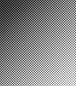 So how does a black-and-white image (a picture, as opposed to type or a vector diagram) get printed? It begins with a halftone screen. This is an old analog technology that is modeled in modern image-processing software. In the analog world, a photo was placed on a copy board, and a photograph was taken of that photo with a piece of ruled film in front of the new film that was to be exposed. The rulings on the face of the film (the halftone screen) caused the light reflected from the image being photographed to diffract on the way through the thickness of the screen, producing halftone dots on the new film. Those dots were proportionate in area to the amount of light coming through that particular rectangle on the screen. So the dots varied in size. If you stood far enough away from the photo, it did not look like a rectangular array of oval dots; it looked like a continuous tone image, like the original. The spacing of the rulings on the screen determined the quality of the printed image. A newspaper might have used an 85-line screen, that is, a screen with 85 lines per inch. A weekly magazine or a history book might have used a 110- or 133-line screen (133 being considered good quality). A monthly might have used a 150-line screen. I think National Geographic used 175, and some art book printers used 200 lines per inch. At 150 lines per inch, a halftone dot occupies an area 16 printer dots square, any fraction of which can carry ink. But if you look at any halftone image, either black-and-white or color, under a magnifying glass, you can clearly see the halftone dots, in all their various combinations of sizes and grid orientations, that make up the image. (If you don’t want to squint through a magnifying glass, you can just look at paintings by Chuck Close, who exploited the halftone illusion in his wall-size portraits.)